6 Best Color Mixing Charts For Beginners To Master
Master color theory with these 6 essential mixing charts. Learn to create precise hues, balance tones, and elevate your painting skills with ease and accuracy.
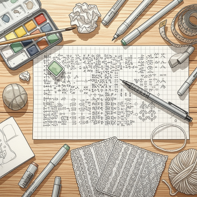
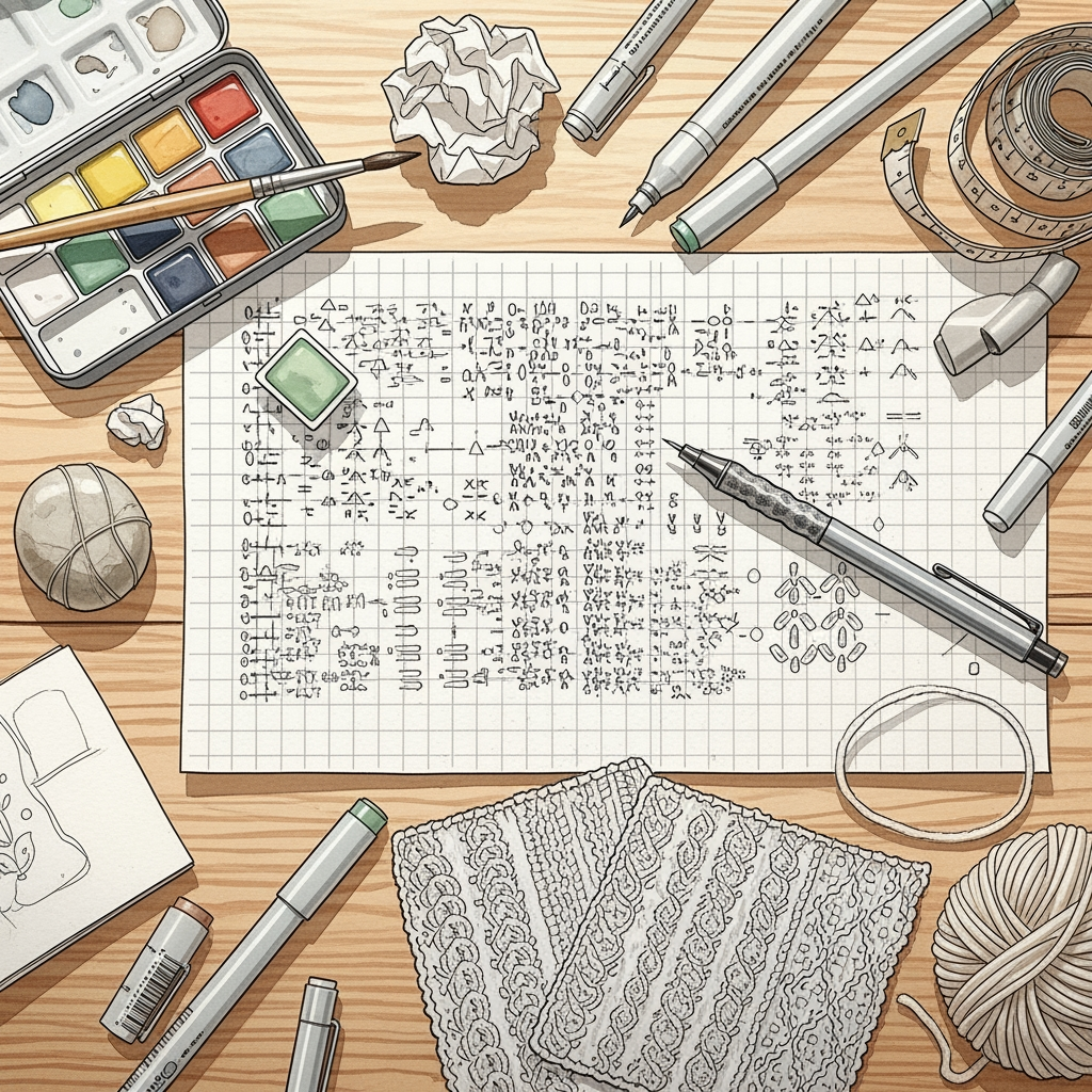
Choosing the right color palette is often the most intimidating step in starting a complex knitting project. While digital screens provide a starting point, the way fiber absorbs dye and interacts with neighboring shades is a physical science. Mastering color mixing requires moving beyond the color wheel and into the tactile reality of your chosen yarn. These six resources act as your roadmap to building harmonious, professional-looking color combinations.
The Color Theory for Knitters Mixing Guide
Color theory in knitting is fundamentally different from painting because you are layering textures and light-absorbing fibers. A basic color wheel helps you identify complementary and analogous shades, but it doesn’t account for how a fuzzy mohair looks next to a crisp, smooth merino.
Beginners often fall into the trap of choosing colors that look perfect on a screen but clash when knitted into a swatch. The key is to focus on value—the relative lightness or darkness of a color—rather than just the hue. If you squint at your yarn balls and they disappear into a single grey blob, your project will lack the necessary contrast to make your stitch patterns pop.
Always prioritize high contrast for stranded colorwork, like Fair Isle, to ensure your motifs remain legible. For gradients or stripes, rely on subtle shifts in value to create a seamless transition. Remember, the best color theory guide is the one you can hold in your hands alongside your actual yarn.
The Knit Picks Palette Yarn Color Chart

The Knit Picks Palette chart is a staple for a reason: it offers an expansive range of shades in a consistent, reliable fingering-weight wool. Because the fiber content and twist remain identical across the entire line, you can trust that your color transitions will be uniform.
This consistency is vital when planning a project with dozens of colors, such as a large intarsia blanket. You don’t have to worry about one color "bulking up" the fabric while another makes it look thin, as the WPI (wraps per inch) remains stable.
However, keep in mind that this is a 100% Peruvian Highland wool, which has a bit of "tooth" or grip. It is excellent for colorwork because the fibers cling to one another, preventing gaps in your floats, but it isn’t the softest choice for those with sensitive skin. Use this chart when you need predictability and structural integrity in your color planning.
Rowan Felted Tweed Color Mixing Reference

Rowan Felted Tweed is a designer favorite because of its unique, heathered appearance. The blend of wool, alpaca, and viscose creates a soft, rustic halo that blurs the lines between adjacent colors.
When using this as a mixing reference, pay attention to how the "heathering"—the tiny flecks of different colors within a single strand—affects the overall tone. These flecks act as a bridge, making it much easier to pair colors that might otherwise look jarring together.
Because this yarn has a slight halo, it softens the transition between bold colors, creating a vintage, painterly effect. If you are aiming for sharp, graphic lines, look elsewhere; if you want a soft, blended, and sophisticated palette, this is your best tool.
Jamieson’s of Shetland Shade Card Guide
Jamieson’s Spindrift is the gold standard for traditional Fair Isle knitting, and their shade card is essentially a masterclass in history and tradition. This yarn is distinctively "sticky," meaning the fibers are slightly coarse and prone to clinging, which is exactly what you want for steeking or intricate stranded work.

The color range is vast, specifically designed to work in harmony within the complex, geometric patterns of Shetland heritage. When using this guide, you’ll notice many shades are "earthy" or muted, which prevents the final garment from looking overly synthetic or neon.
Don’t be discouraged by the texture; while it might feel scratchy on the skein, it blooms beautifully after a good soak and block. Use this guide when you want to replicate authentic, long-lasting colorwork that will stand the test of time.
The Woolfolk Far Yarn Color Theory Wheel

Woolfolk Far is made from Ultimate Merino, which is exceptionally soft and has a matte, luxurious finish. Because this yarn is so smooth and refined, the colors appear very saturated and true to the eye.
The color theory here leans toward modern, minimalist palettes. The shades are often muted, sophisticated, and designed to look intentional when placed next to one another.
If you are knitting a garment that requires a high-end, professional finish, this collection is unmatched. Be aware that because the fiber is so fine, it can pill if subjected to high friction; choose your project type accordingly. This is the go-to for luxury garments where color harmony is the primary design feature.
Cascade 220 Heathers Color Matching Chart

Cascade 220 is the workhorse of the knitting world, and their "Heathers" line provides a massive spectrum of colors at an accessible price point. The heathering—a process where different dyed fibers are blended before spinning—gives each color depth and dimension.
This chart is perfect for beginners because it allows you to experiment with large palettes without a massive financial investment. The yarn is a standard worsted weight, making it ideal for testing color combinations for sweaters, hats, or blankets.
The trade-off is that it lacks the specific "sticky" quality of Shetland wool or the extreme softness of high-end merino. However, for learning how colors interact in large-scale projects, nothing beats the sheer variety of the Cascade 220 chart.

Brooklyn Tweed Loft Color Planning Guide
Brooklyn Tweed Loft is a woolen-spun yarn, which means the fibers are arranged in a chaotic, airy structure rather than a tight, smooth twist. This gives the yarn a unique ability to trap air and light, making colors appear soft and ethereal.
When planning with Loft, consider how the "woolen-spun" nature creates a lighter, more delicate fabric. Your color choices will look more like watercolor washes than solid blocks of paint.
Because this yarn is fragile, it is best suited for garments that won’t see heavy daily wear. It is, however, the best choice for knitters who prioritize a light, airy, and artistic aesthetic in their colorwork.
How to Test Color Combinations Before Casting On
Never skip the swatch, even if you’ve spent hours with your color charts. A "color swatch" should be at least 4×4 inches, worked in the pattern you intend to use, to see how the colors physically overlap.
Take a photo of your swatch in natural daylight and convert it to black and white. If the colors don’t show clear differences in the grayscale image, your design will likely look muddy once knitted.
If you are short on time, at least wrap your chosen yarns around a piece of cardboard in the order they will appear in your project. This "yarn bar" trick helps you spot any colors that disrupt the flow of the palette before you commit to the labor of knitting.
Understanding Undertones in Wool Color Theory
Every color has an undertone, either warm (yellow/red) or cool (blue/purple). Even a "neutral" grey can lean towards a blue base or a brown base, which can make or break your project.
If you are mixing colors, try to keep the undertones consistent within your palette unless you are intentionally creating a high-contrast pop. Mixing a cool-toned blue with a warm, golden yellow can create a vibrant, energetic look, but it requires a careful hand.
When in doubt, hold the yarns against your skin or a piece of white paper. You will quickly see if a color looks "flat" or "alive" against the backdrop, which is a great indicator of how it will behave in your final fabric.
Tips for Balancing Contrast in Fair Isle Work
In Fair Isle, you generally use two colors per round: a "background" color and a "pattern" color. The secret to a successful project is ensuring the pattern color always has a higher contrast against the background than the background has against itself.
If your pattern color is too close in value to your background color, the design will "swim" and lose its definition. Beginners often choose colors that are too similar in intensity, resulting in a project that looks blurred from a distance.
If you find your contrast is lacking, try swapping one of your colors for a shade that is significantly darker or lighter. Always prioritize the clarity of the motif over the beauty of the individual colors; a beautiful color in the wrong spot can ruin an entire design.
Mastering color is a journey that evolves with every project you finish. Don’t be afraid to make mistakes, as even a "failed" color combination teaches you more about fiber than any chart ever could. Trust your eye, listen to the texture of your yarn, and enjoy the process of creating something uniquely yours. Happy knitting!