
6 Best Color Charts For Coordinating Fringe With Yarn
Master color theory with these 6 essential charts. Learn to perfectly coordinate yarn and fringe for professional, cohesive textile projects every time.
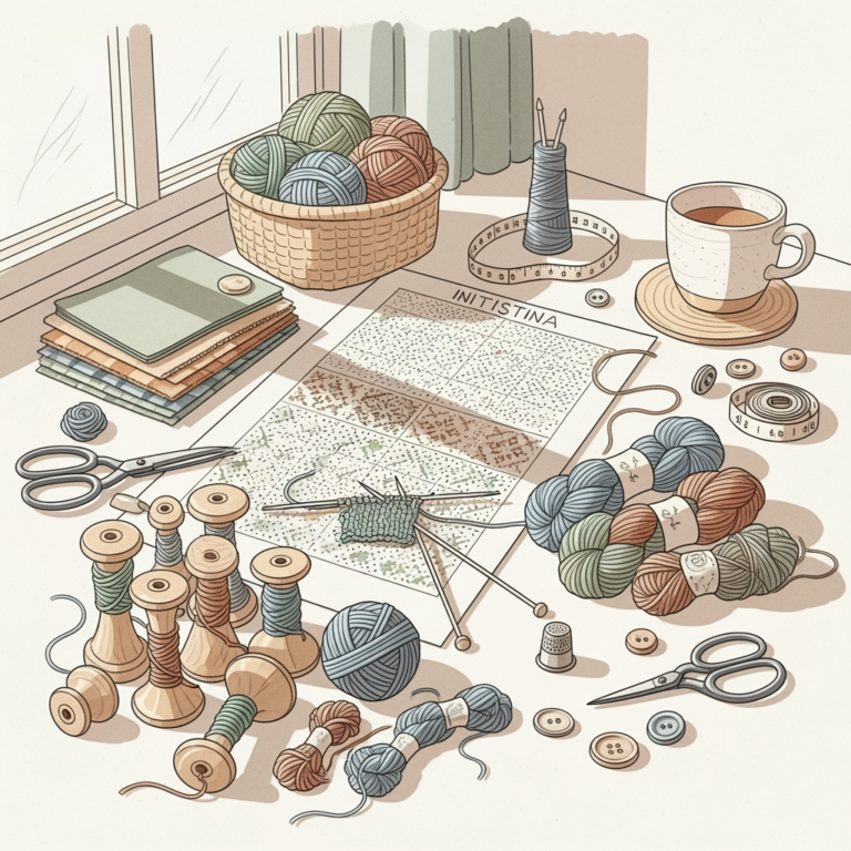
Adding fringe is the ultimate finishing touch, but choosing the right color can make or break the visual harmony of your finished piece. Whether you are aiming for a subtle tonal effect or a bold, high-contrast statement, the secret lies in using professional color tools to guide your selection. This guide explores the best resources to help you bridge the gap between your main yarn and decorative fringe. With the right color strategy, you can elevate a simple project into a sophisticated, cohesive work of art.
Pantone Formula Guide: Best for Precise Color Matching

The Pantone Formula Guide is the industry standard for a reason. If you are trying to match a specific dyed-to-order yarn or a custom-spun wool, this guide offers an unmatched level of color accuracy.
For knitters who obsess over the subtle shift between "Sage" and "Olive," this tool removes the guesswork. It provides physical, coated swatches that you can hold directly against your yarn skeins in natural daylight.
The primary trade-off is the cost and the fact that yarn doesn’t always reflect light like the printed ink on a Pantone chip. Remember that fiber texture—like the halo of mohair versus the smooth twist of cotton—will change how you perceive the color match.
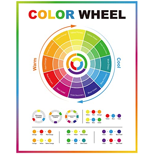
Adobe Color Wheel: Best for Digital Palette Planning

When you are planning a complex project, the Adobe Color Wheel is an incredible digital playground. It allows you to visualize complementary, analogous, and triadic color schemes before you ever step foot into a yarn shop.
I often use this tool when I have a stash of leftover yarn and need to see how a vibrant fringe might interact with a neutral base. You can input the hex code of your main yarn to see exactly which fringe colors will pop or blend.
Just keep in mind that screens are backlit, while your finished sweater will be viewed in ambient light. Always treat these digital palettes as a starting point rather than a final decree.
The Color Catalog: Best for Seasonal Fringe Trends

The Color Catalog is a fantastic resource for knitters who want their projects to feel intentional and current. It organizes colors by mood and season, which helps when you are stuck in a creative rut.
If you are working on a fall shawl, looking at a curated "autumnal" palette can prevent you from choosing a fringe that feels jarringly out of place. It simplifies the overwhelming number of choices into a manageable, aesthetically pleasing set.
However, don’t let trends dictate your entire project if the colors don’t speak to you. The best fringe is the one that makes you want to wear the garment again and again.
Design Seeds Palettes: Best for Nature-Inspired Hues

Design Seeds is a treasure trove for those who love organic, earthy color combinations. By pulling colors from high-resolution nature photography, these palettes offer a grounded, harmonious look for your fringe.
These palettes are particularly useful if you are using wools with natural, undyed tones. They teach you how to balance warm and cool undertones, which is essential for creating a fringe that feels like a natural extension of the fabric.
Be aware that these palettes often include very subtle variations. If you are working with a limited yarn budget, focus on the dominant colors in the palette rather than trying to source every single shade.
Color Matters Chart: Best for High Contrast Fringe
If you want your fringe to be the focal point of your project, the Color Matters chart is your best friend. It highlights the principles of value contrast, which is the difference between light and dark colors.
A high-contrast fringe can add drama to a simple garter stitch scarf or a plain hemlined sweater. The key is ensuring that the fringe yarn has enough visual "weight" to stand up to the main fabric.
Avoid the mistake of choosing two colors that are high in contrast but clash in undertone. If your main yarn is a cool-toned blue, a warm-toned orange fringe might look muddy rather than intentional.
YarnSub Color Matcher: Best for Fiber Compatibility
YarnSub is an indispensable tool for checking if your fringe yarn will behave like your main yarn. While it focuses on fiber substitution, its color matching features are excellent for finding yarns that share similar dye lots or color families.
This is critical because you want your fringe to have the same drape and weight as the rest of your garment. If the fringe is too heavy, it will pull on the fabric and distort your stitches over time.
Always check the fiber content before finalizing your color match. A synthetic fringe on a delicate merino wool base might wear differently, leading to an uneven appearance after the first wash.
How to Balance Fringe Texture With Yarn Color Depth
Texture and color depth are inextricably linked in fiber arts. A dark, matte yarn will absorb light, while a shiny, metallic, or silk-blend fringe will reflect it, making the color appear lighter and more vibrant.
When working with deep, saturated colors, consider using a fringe with a slight sheen to add dimension. If your main yarn is highly textured, like a boucle or a nubby wool, keep your fringe color relatively simple to avoid a cluttered look.
Balance is the goal here. If the yarn is busy, let the color be simple; if the yarn is simple, don’t be afraid to experiment with a fringe that has more complex color depth.
Understanding Color Theory for Decorative Accents
Color theory isn’t just for painters; it’s a vital tool for any knitter. Understanding the color wheel—specifically how primary, secondary, and tertiary colors relate—can help you make bold choices with confidence.
Use complementary colors (those opposite each other on the wheel) if you want the fringe to vibrate and stand out. If you prefer a sophisticated, understated look, stick to monochromatic or analogous schemes that sit next to each other on the wheel.
Don’t forget the importance of value. Even if two colors are in the same family, a difference in lightness or darkness (value) is what will make your fringe visible against the background.
Testing Dye Fastness Before Adding Fringe Details
There is nothing more heartbreaking than a beautiful fringe bleeding into your hard-won knitting after a wash. Always perform a test on a small swatch before attaching fringe to your final project.
Soak your fringe yarn in warm water with a bit of wool wash, then press it between two white paper towels. If you see any color transfer, you need to either choose a different yarn or treat the fringe to fix the dye.
This step is non-negotiable for high-contrast projects, such as a white base with a deep red fringe. Better to spend an hour testing now than to ruin a hundred hours of knitting later.
Tips for Maintaining Fringe Integrity After Washing
Fringe requires a bit of extra love to stay looking crisp. When washing, treat the fringe as a delicate extension of the garment by gently squeezing it rather than wringing it out.
To prevent tangling, I recommend braiding the fringe loosely before placing the item in a mesh laundry bag. Once dry, you can gently comb out the fringe with a wide-tooth comb or your fingers.

If the fringe begins to fray, you can trim it slightly to keep it looking sharp. Remember that natural fibers will bloom and soften with time, which is part of the charm of a well-loved hand-knitted piece.
Coordinating fringe with your yarn is an exercise in both precision and personal expression. By leveraging these color charts and keeping fiber properties in mind, you can ensure your decorative accents are as durable as they are beautiful. Take your time, test your materials, and trust your creative instincts throughout the process. Your finished project will reflect the care you put into every single detail.